

The story of
Fer Cozzi, a figure-skater and dreamer who wrote her story with her own fonts.
Once upon a time, there was a little girl who dreamed of being a figure skater. It wasn’t so much about the skating as the shapes and figures that drew her in.
Precise lines and beautiful shapes are two things figure skating and design share. After going to see Castles on Ice, she decided that figure skating wasn’t for her. She still wanted to create shapes, but in a slightly different way.
In high school, she started thinking she would go to college for design. At first, she was interested in industrial design, because “you create actual things.”
{{space}}
“You create actual things.”
- On Design
{{space}}
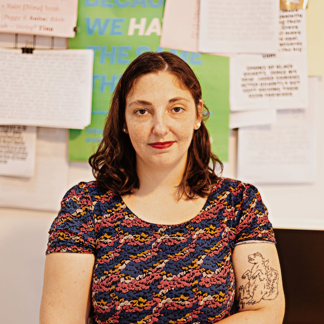
At some point, something happened. One of her high school teachers taught a class on fonts. Fer had no idea you could make fonts for a living. In fact, she hadn’t even considered graphic design until then. But the shapes were still on her mind so she decided to give it a try.
And surprise, surprise… she loved it. Everything about it. She loved the classes on graphic design, the ways of thinking about design and actually designing. She loved every single letter, every single family of fonts, and that made her see them from a completely different perspective.
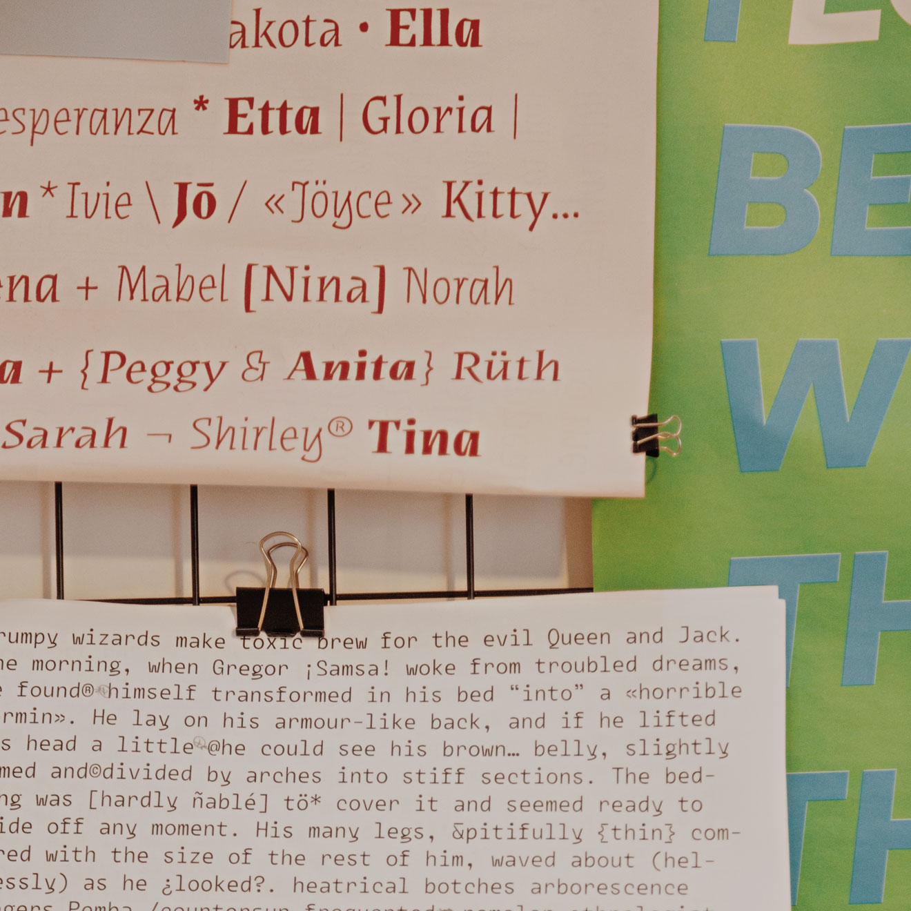
“It’s not the style that makes the difference: it’s the actual font!”
- On Typography
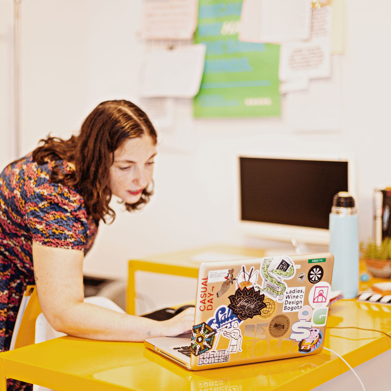
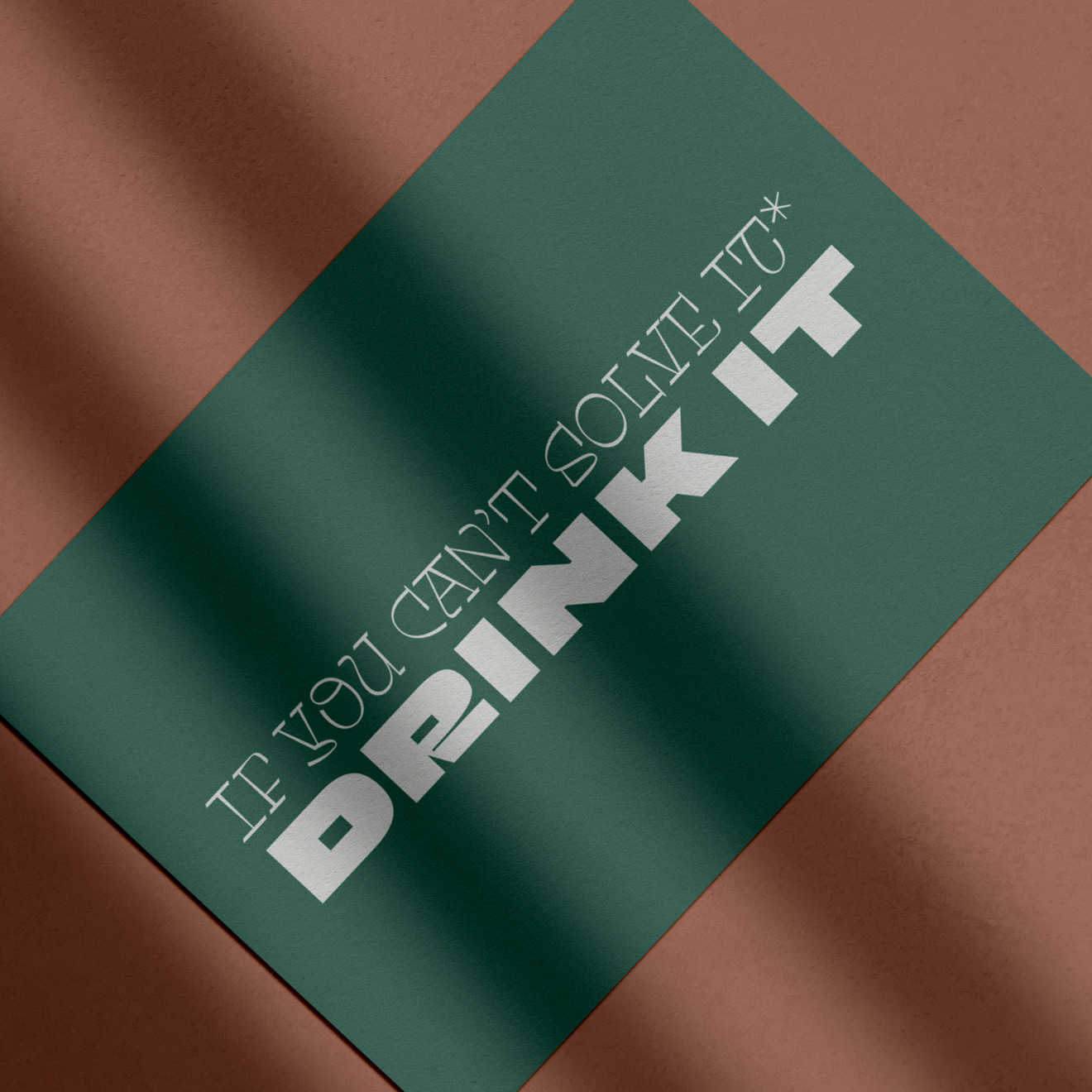
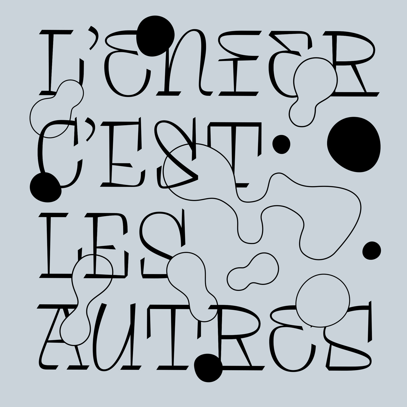
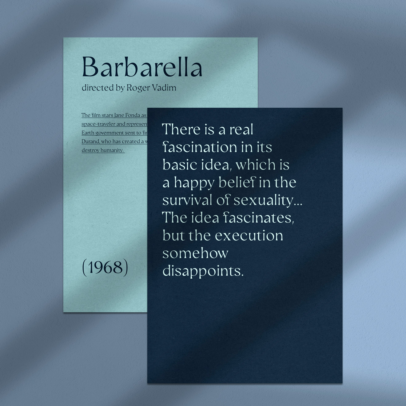
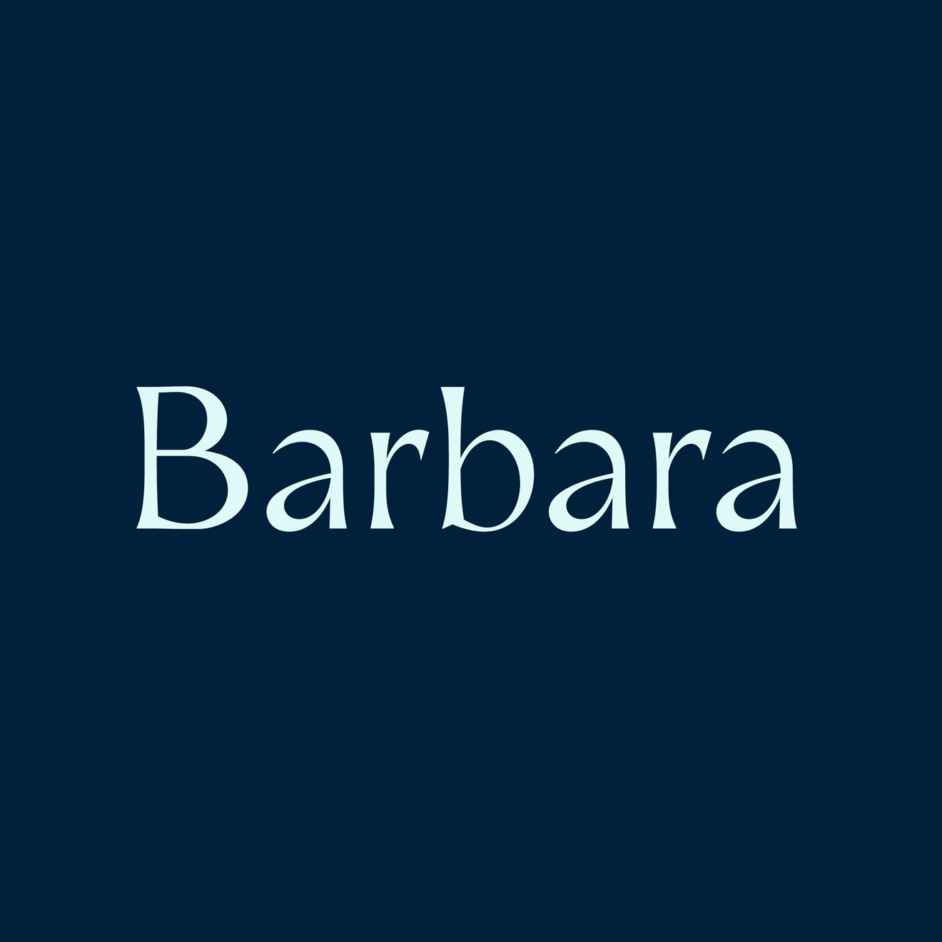
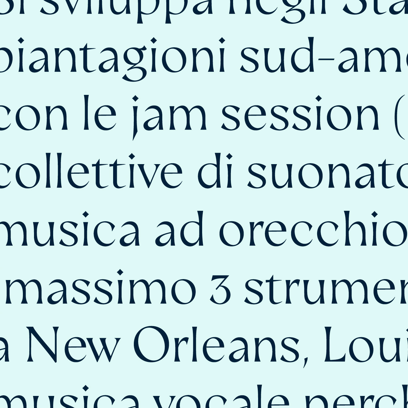
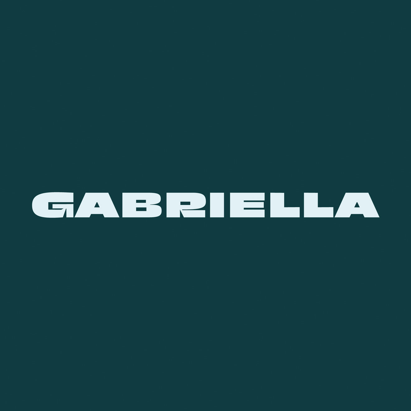
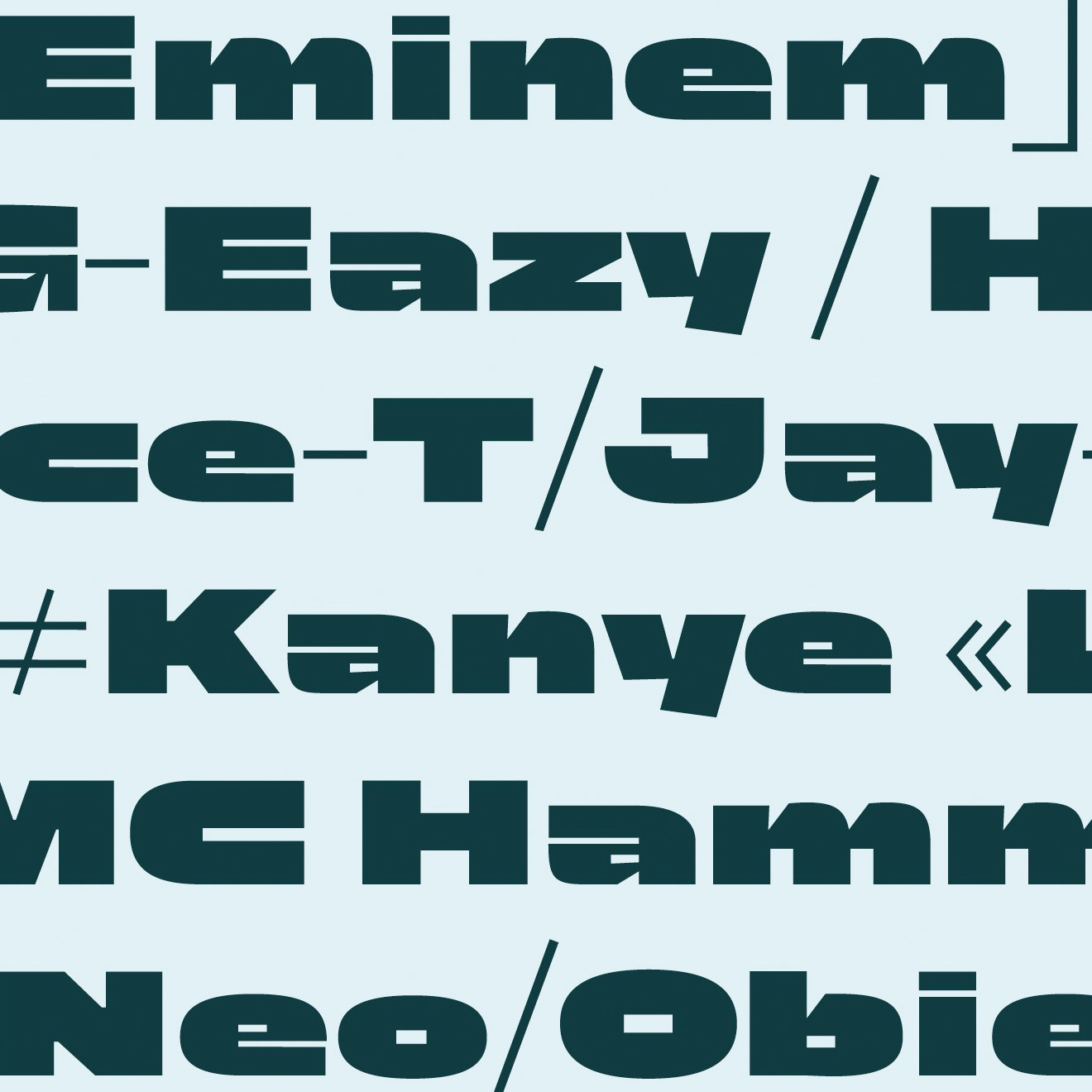
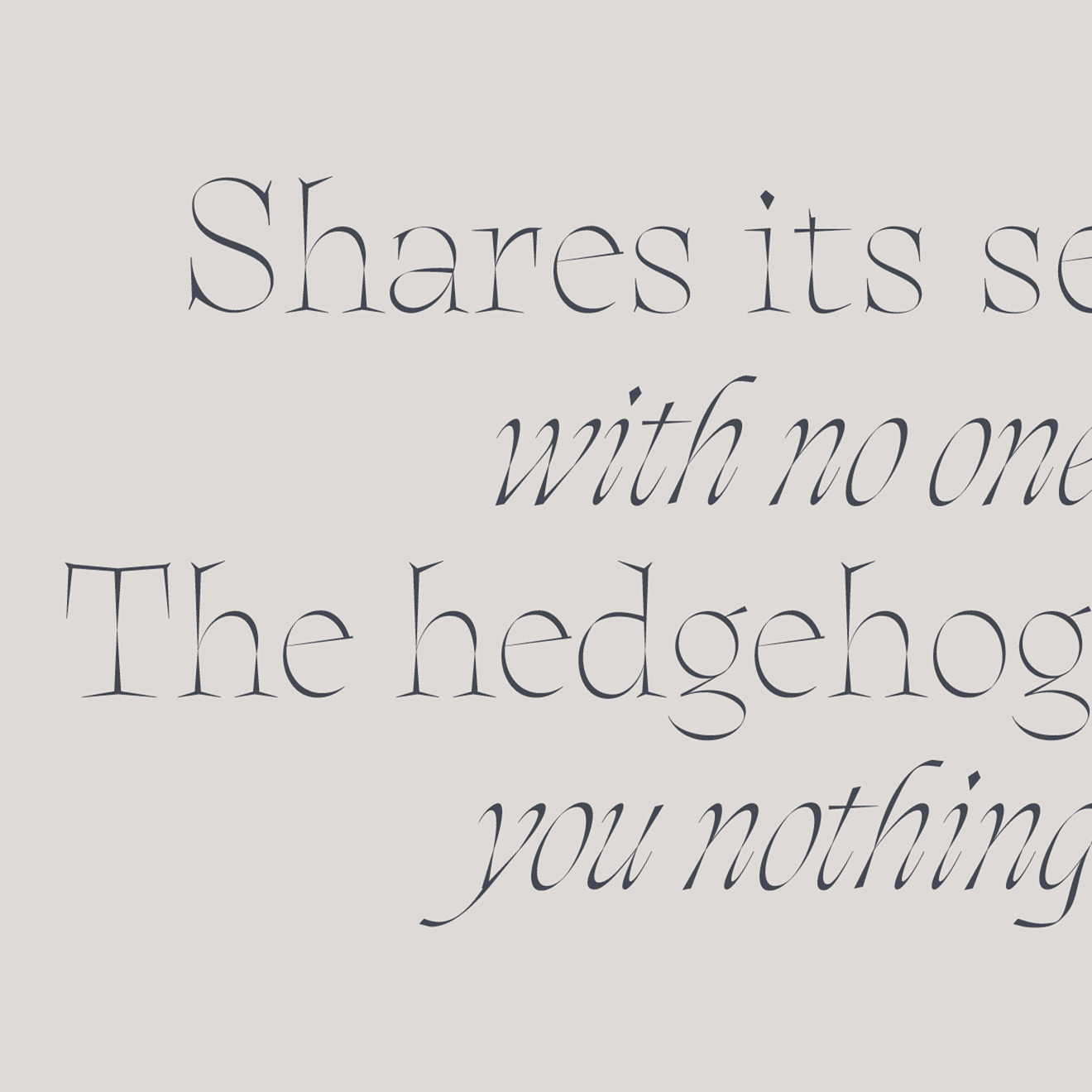
She started taking classes on type design and calligraphy, shaping her career based on her love for letters. And now she sells her own fonts.
Inspired by people, music and movies, this typeface artist, calligrapher and designer from Argentina has given several workshops on experimental type design, calligraphy and monograms.
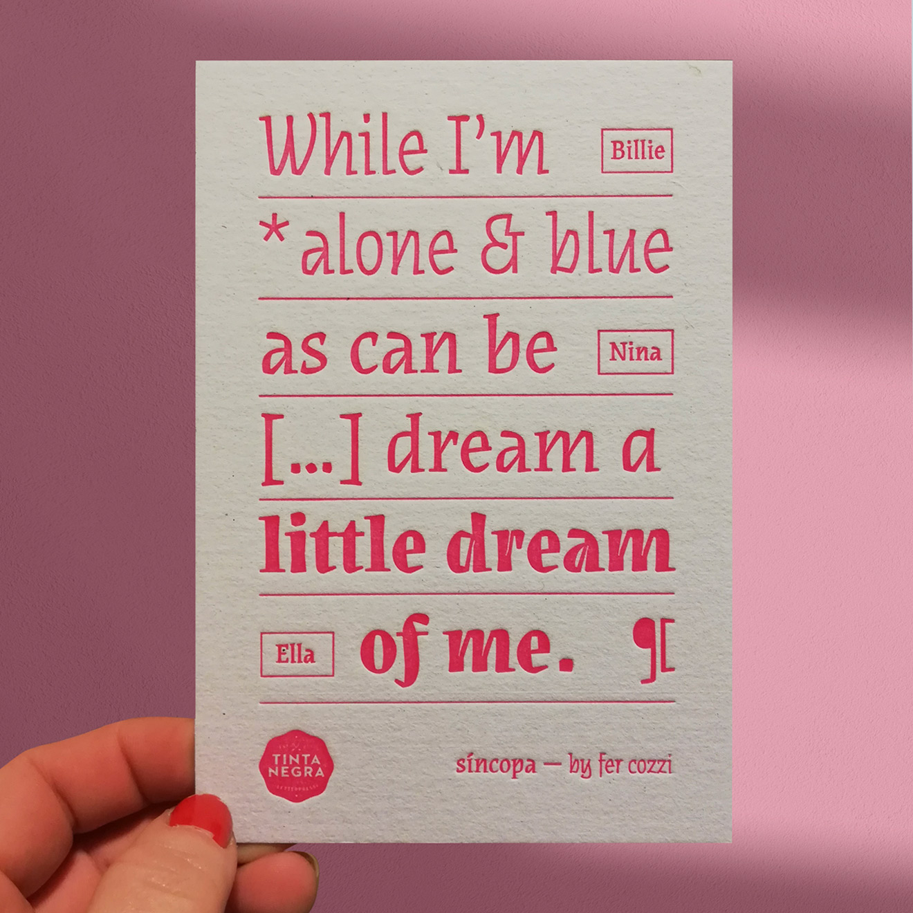
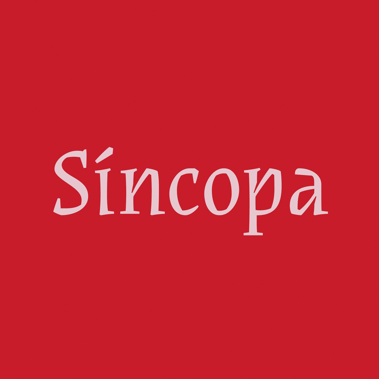
She has been a regular at the Tipos Latinos Argentina biennial since 2010, and her Síncopa Font has been selected for other renowned type design exhibitions such as Pangramme.
Is her talent fueled by mate, wine, food and the jaded Argentine mindset? Maybe. Maybe not.
But one thing’s for sure: Fer’s completely different approach to design can be attributed to her love for letters and expertise.
{{space}}
![]()
“Creating your own font is ultimately the best way to go.”
- On Brand & Fonts
Her knowledge about fonts gives her a completely different perspective than other graphic designers. You can choose a family based on your idea, but each family has a bunch of different fonts and each one is unique: “It’s not the style that makes the difference: it’s the actual font!”
We can try to explain the growing importance of type design but Fer puts it best: “There used to be a certain romanticism associated with choosing a font. Now it’s a question of budget: creating your own font is ultimately the best way to go.”
Companies like Apple, Google, Netflix and Spotify, all of which have designed their own fonts, would clearly agree with her.
{{space}}
“Managing ideas from Argentina while producing in Europe. So fun and challenging.”
- On Macramè
But she’s not only devoted to letters: she also loves to teach. Fer teachers graduate classes at the University of Buenos Aires and loves sharing her knowledge with her colleagues.
And that has shaped her professional network. “I mostly work with students past and present. They’re my trusted network.”
She loves teaching, yes, and what she most enjoys about working with Macramè is that there are a lot of people involved in each project and she has the opportunity to share her knowledge and learn.
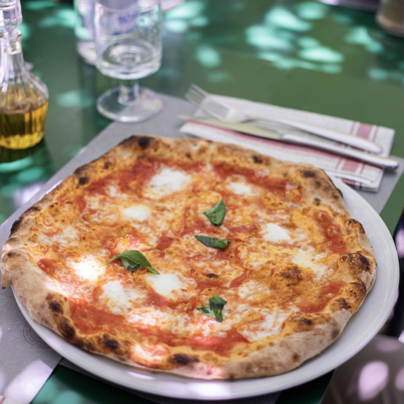
When it came to designing an identity for Pizzeria Al-4m she and the team had to work from scratch on the concepts, ideas, deliverables, etc. They had total freedom to come up with innovative ideas, from the restaurant menu to the card holder and other items.
“The most challenging part was managing ideas and drafts from Argentina while producing in Europe. But it was also fun and very rewarding!”
{{space}}
![]()
![]()
![]()
![]()
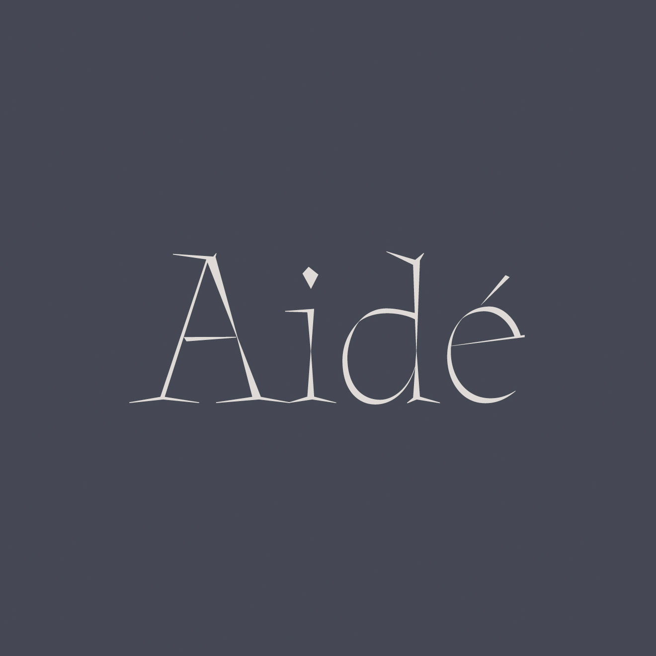
That’s the story of the girl who fell in love with letters. So in love, in fact, that her hedgehog Aidé, who was along for five years of her journey, even has her own font.
That love shines through: Fer received the Sello Buen Diseño in 2018 and a year later, was selected as one of ten Ascenders by the Type Directors Club, a group of designers under 35 who have shown remarkable achievement in typography, type design, and lettering.
Foundries she has worked with

Working
Type Designer Art Director
Living
Argentina
Teaching
Assistant professor in the Master’s Program of Typeface Design at University of Buenos Aires - Argentina
Professor in typography at UCES University - Argentina
Awards
Sello Buen Diseño 2018 - Argentina
7th Latin American Type Design Biennial, Tipos Latinos - Latinoamérica
Pangramme, International student type design exhibition - France
Type Directors Club Ascenders 2019 - USA
Website
fercozzi.com
fercozzi_letras